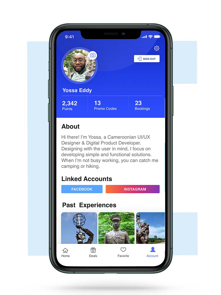
Travel Experience App
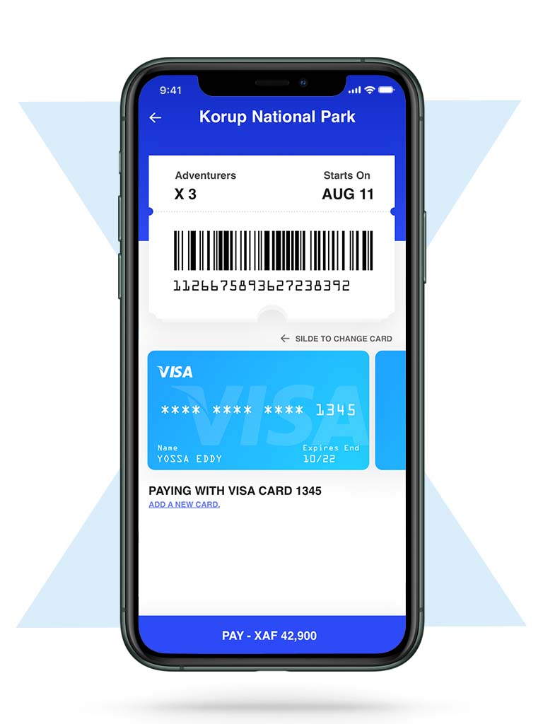
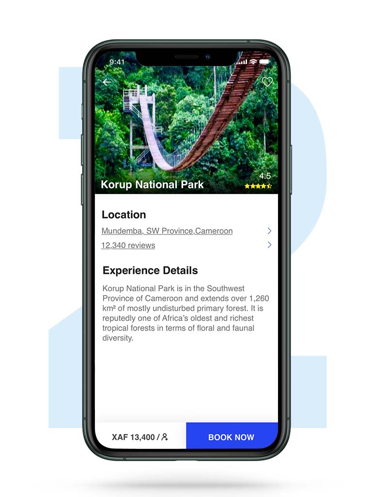
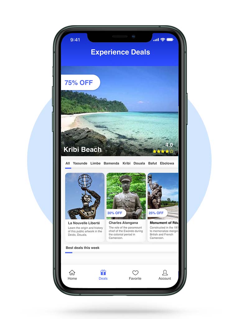
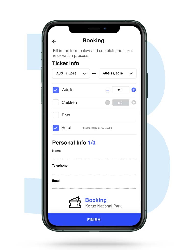
Experience Cameroon, a travel app designed to connect users with local tour guides for immersive trips across the beautiful landscapes and vibrant culture of Cameroon. This West African gem offers rich traditions, breathtaking scenery, and unforgettable experiences. With the Experience Cameroon App, travelers can easily book guided tours that showcase the best the country has to offer.
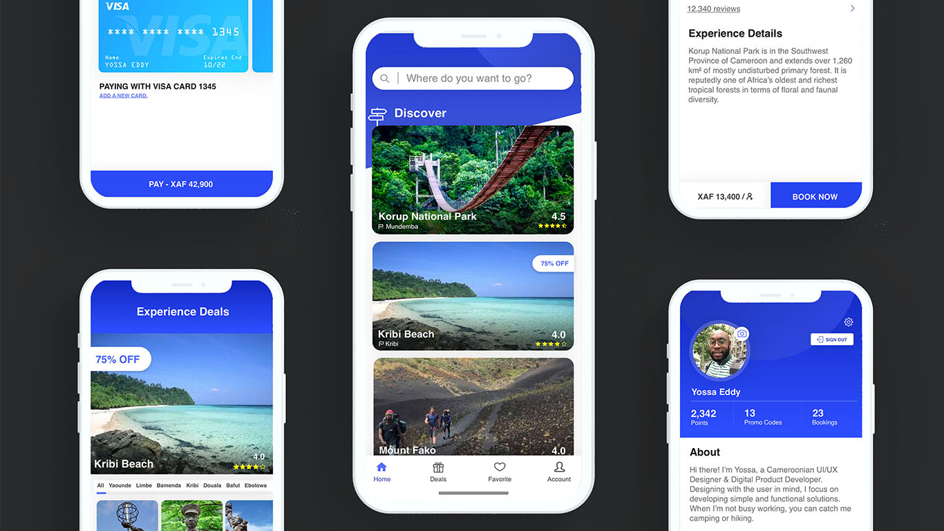
This mockup presentation aims to demonstrate the app’s user-friendly interface and potential to attract both tourists and investors.
Date:
July 5, 2021
Services:
UI Design – Investor Presentation
Client:
Experience Cameroon
Style Sheet : simple, inviting and user-friendly
I aimed to create a modern, inviting, and user-friendly interface that enhances the user experience. Here’s an overview of the design elements used
Primary Color (#2644EF): A bold and vibrant blue that symbolizes trust, reliability, and professionalism. It reflects the app’s goal of providing a trustworthy platform for users to explore Cameroon confidently.
Secondary Color (#536DFE): A lighter blue accent that complements the primary color. It’s used to highlight important UI elements, creating a visually cohesive and engaging experience.
Text Color (#212121): A neutral dark shade for all text, ensuring readability and accessibility across various screen sizes and backgrounds. This color contrasts well with the bright blues, making the text stand out without overwhelming the user.
Font – Helvetica: We chose Helvetica for its clean, modern look and excellent readability on digital interfaces. Its simple and minimalist style aligns with the app’s goal of delivering a straightforward, easy-to-use booking experience.
Together, these design choices create a visually appealing and intuitive interface that enhances user interaction and reflects the essence of the Experience Cameroon brand.

User INterface of 6 key pages

